Wedding stationary.
Last year, my lovely sister got engaged and immediately tasked me with the job of creating her wedding stationary! How could i possibly refuse? I think if I had, my Christmas present for the next ten years would’ve been something out of the bargain bin at the pound shop so it was in my interest to keep her sweet.
Cheryl had a clear idea from the start of what she wanted the stationary to look like and what sort of colour palette she would like to have. I must say, she has a brilliant eye for colour and detail so that made things so much easier. With the wedding planned for Autumn 2023, the colours were a mixture of rusty oranges, sage greens, eucalyptus and platinum. What striking colours they were!
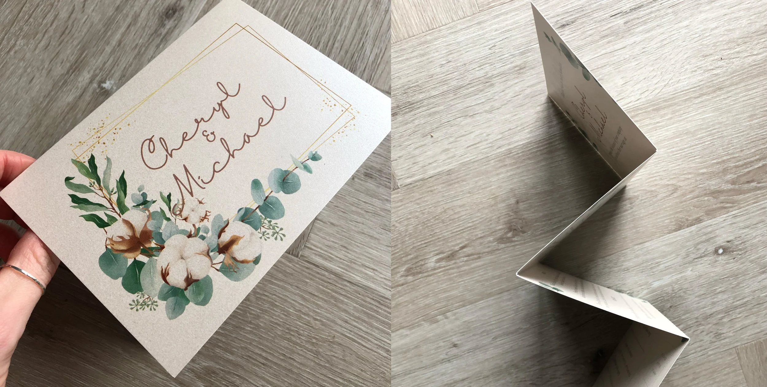
The invitations
The first job was creating the day and evening invitations. There were a lot of details and copy to include on the day invites including venue, date, map and menu choices so it naturally lent itself to being a double-sided accordion design. Printed on a 300gsm Sirio Pearl Oyster paper, the invites were then folded and perforated at the RSVP. The end result was beautiful and Cheryl and Mike were delighted with them.


Menus and chair tags
Once the invites had been sent out in early January, 6 months later it was time to create the menu designs, chair tags, table plan and order of the day. Each menu design was bespoke with the guest’s chosen menu order and name. Printed on the same Sirio Pearl Oyster stock as the invitations, the menus were then individually hole-punched with a bronze eyelet and threaded with a frayed rust ribbon. The chair tags followed a similar look but had a thinner rust ribbon and were tied around the chair backs for the ceremony.


Order of the day
The order of the day was printed on 200gsm paper and mounted on a sturdy A2 foam board. This was the first thing people saw as they entered the wedding venue so it had to be eye-catching! The design featured the bride and groom’s names along with a visual timeline of what the day had in store. The icons were hand-drawn and were combined with the graphic elements from the other stationary to keep things nice and consistent.

The table plan
The table plan was also mounted on A2 foam board and featured the same florals from the invites and menus along with a hand-drawn picture of the wedding venue, the beautiful Shireburn Arms. With a quick last-minute change to the seating plan due to a surprise visit from the groom’s brother in New Zealand, off it then went to Entwistles the printers. The design looked great on the day and sure enough, pointed everyone to their respective seats. Job done!


As part of my gift to the newlyweds, I ordered a print of the drawing i’d created of the Shireburn Arms. Printed on a textured 250gsm Perlino Cotton stock, it looked great in an oak-styled frame.


Overall, Cheryl and Mike loved their wedding stationary and it all looked perfect on the day in the wedding setting. Hopefully there will be no bargain pound shop presents off Cheryl this Christmas too!